Swaystack
I was approached by Swaystack's founders during their early concept phase to help shape their vision for the fintech startup. Working closely with the company CEO and CTO, I crafted brand guidelines, designed their logo, and created an initial investor deck. I also led the preliminary app UX/UI design, and designed graphic elements for their website ensuring the brand identity remained consistent across platforms.

Logo
I designed the Swaystack logo to evoke motion, power, and influence, symbolizing “swaying in the right direction.” The blue/violet palette conveys strength, trust, and creativity, while the modern, casual typeface ensures the brand feels both approachable and professional, aligning with Swaystack’s voice and mission.
Brand Guidelines
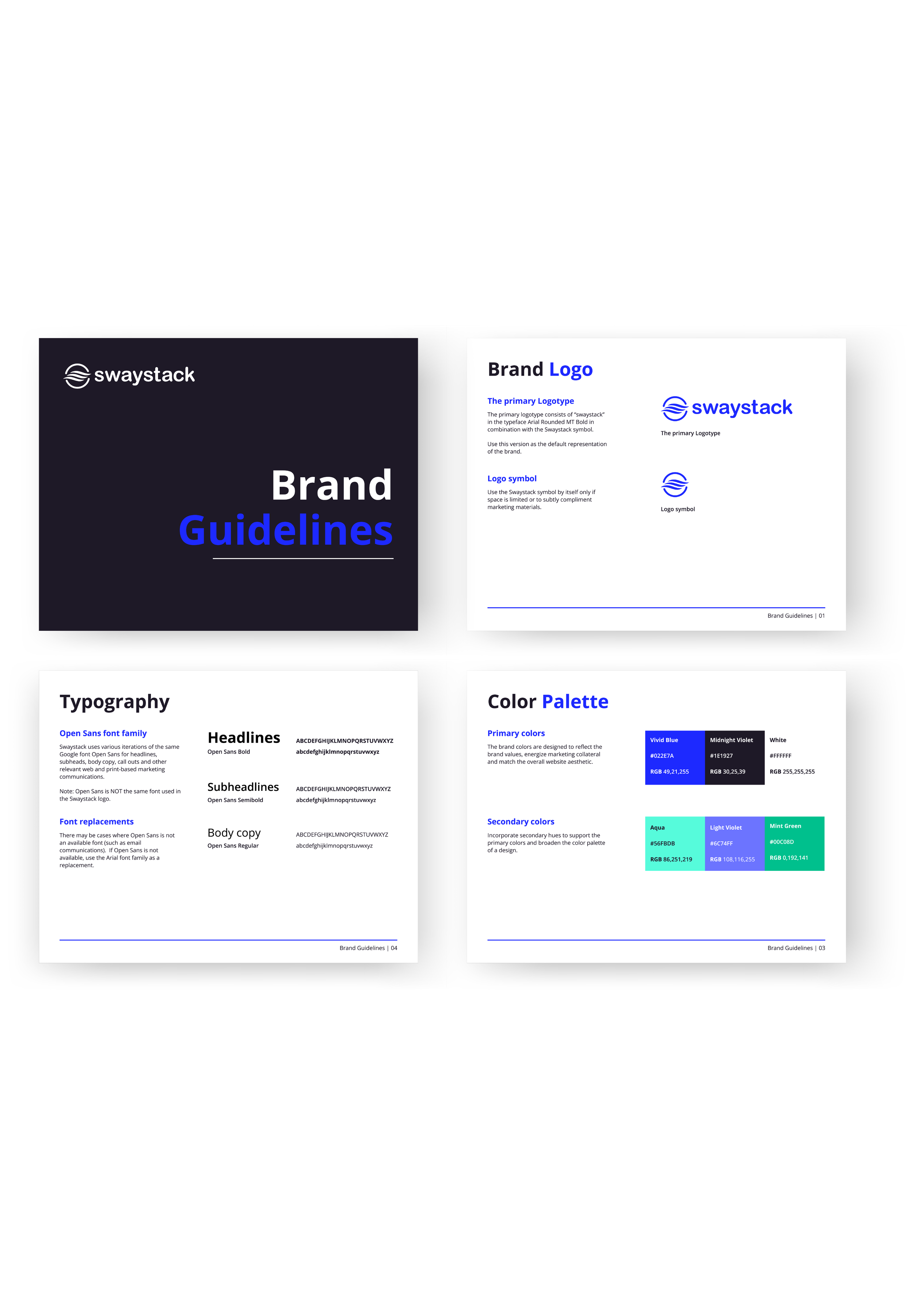
In crafting Swaystack’s brand guidelines, I selected a modern green to symbolize growth and prosperity, blues for building trust, and a subtle midnight violet for a darker accent. The Open Sans font family was chosen for its clean, modern look, versatile across both branding and UX, ensuring a consistent and approachable identity.
Preliminary UX / UI
For Swaystack’s preliminary UX, I designed a sleek and modern agent dashboard, focusing on intuitive button UI, streamlined functions, and clean components. I carefully selected text choices to ensure clarity and ease of use. This foundation set Swaystack’s software design team up with a strong starting point for building out the full platform.


